Top Five Healthcare Website Designs

Career in Web Designing
October 3, 2018
Web Design Trends In Architecture
October 6, 2018
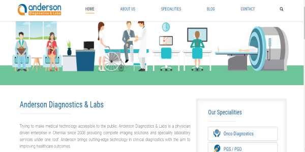
The Website talks about their field of Speciality in Diagnosis and their Laboratory Services. They have a section to send in your Health/Medical related queries. Information is provided about their branches that are spread in India. Blogs section highlights the need to get medical tests done as a preventive measure. The website design is user friendly and gives us clear information about Medical Tests. Detailed information of “How/Why” are provided for every medical test performed.
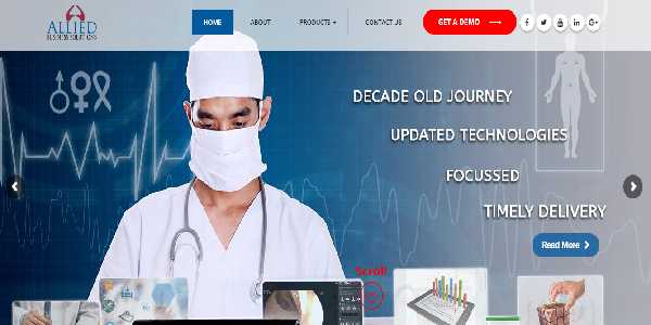
The website provides information about products on Healthcare Image Management Solutions and contains related images. The pages are designed to enable easy navigation and are user-friendly. The White and Blue color combination gives a soothing look to the pages. Every detail is explained along with the images for the user to easily understand. The user can book a demo session on the products.
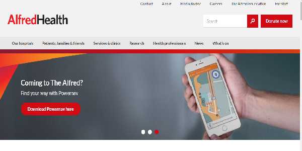
3. The Alfred
When it comes to the website of The Alfred, you will be pleasantly surprised at how easy it is to navigate it. All the information that you are looking for on medical services and Healthcare Image Management Solutions at The Alfred is there, whether it is about them or about how to contact them is right there, and it gives you a very upbeat and positive feel. It also allows you to browse the site, and all the apprehensions that you might have about diagnostics and so on are no longer a problem. The color scheme of this medical site is a cheerful red and white and navigating through the website is a breeze.
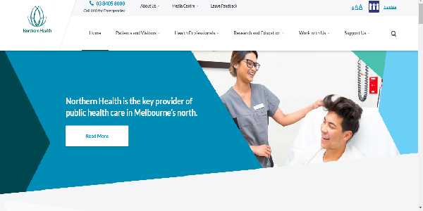
4. Northern Health
The logo of Northern Health is something like a lotus, in a soothing blue and white shade. For people who are apprehensive about how to get the best medical diagnostics and treatment in Australia, you could check out their website and see for yourself. Unlike hospitals whose websites are very scientific looking, this website shows positive emotions, giving people a good feel. Visitors to the site can easily perceive the confidence and positivity both in the patients as well in the medical professionals. This site is efficient and easy to navigate and the pages in this site loads in no times.
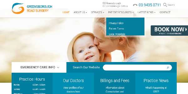
5. Greensborough Road Surgery
The Greensborough Road Surgery website is informative, quick and useful. You have just about everything that you ever wanted to know about medical diagnostics in Australia. The blue and orange website gives you all the information that you’re looking for, the timings, the doctor profiles, the billings and fees, and the medical services that are being offered here. This site gives you a lot of information all on one page and makes it very easy to book an appointment.

10 Comments
When designing a healthcare and hospital website, it is important to make sure that the website is completely user friendly. As the website is used by people who are in distress, it should allow them to accomplish the necessary tasks easily.
The healthcare website should allow the user to find the best healthcare provider and fix appointment. It should save complete medical records, health information and latest test results. It should also allow in settlement of bills. The healthcare website success depends upon UX.
Being a budding website designer, I found this blog motivating and useful. I was able to gain lot of ideas on how to develop healthcare website designs. I would definitely think about adding these features. Thanks for sharing an informative blog.
When developing a hospital website, it should be focused on how the user think and execute. User experience design and exploration is important in hospital website designing. You have to know their concerns and needs, understand users and prioritize accordingly.
The header is important in hospital website. It should be informative and simple. You can add call or phone number button so that the users can click in case of emergencies. The header should have complete information where the user can easily access.
As we are in the world of web these days, these healthcare websites are handy for some quick references and it helps in saving time of going to the doctor personality or those multiple calls which we had to make to connect to the hospitals for appointments.
I have a second thought about browsing these healthcare websites, because it may lead us in wrong directions at times. Not blaming the companies, but the client may not take appropriate actions by going to the doctor in needed case, instead just go through the websites searching solutions for health related issues.
These websites are good reference points, but it will be good to see a live chat options in these sites, so that it helps the site visitor to avail appropriate and immediate answers. It also important that the person who is hanging these chats for the hospitals are really informative.
“I think these websites should restrict their access to people of 16+ age group only. Because it may lead the children’s to misuse these sites for various reasons. For elderly people easy navigation and quick relevant informations in the websites is mandatory. The site should not lead us to search for information.
“
I like the description of these websites, but what would be more useful is a short description about the hospitals managing these sites. While the look and feel of the sites is only secondary for me. Some key details about the healthcare would be more useful, than describing the colors of web page.